Brand work for a new smart duvet product.
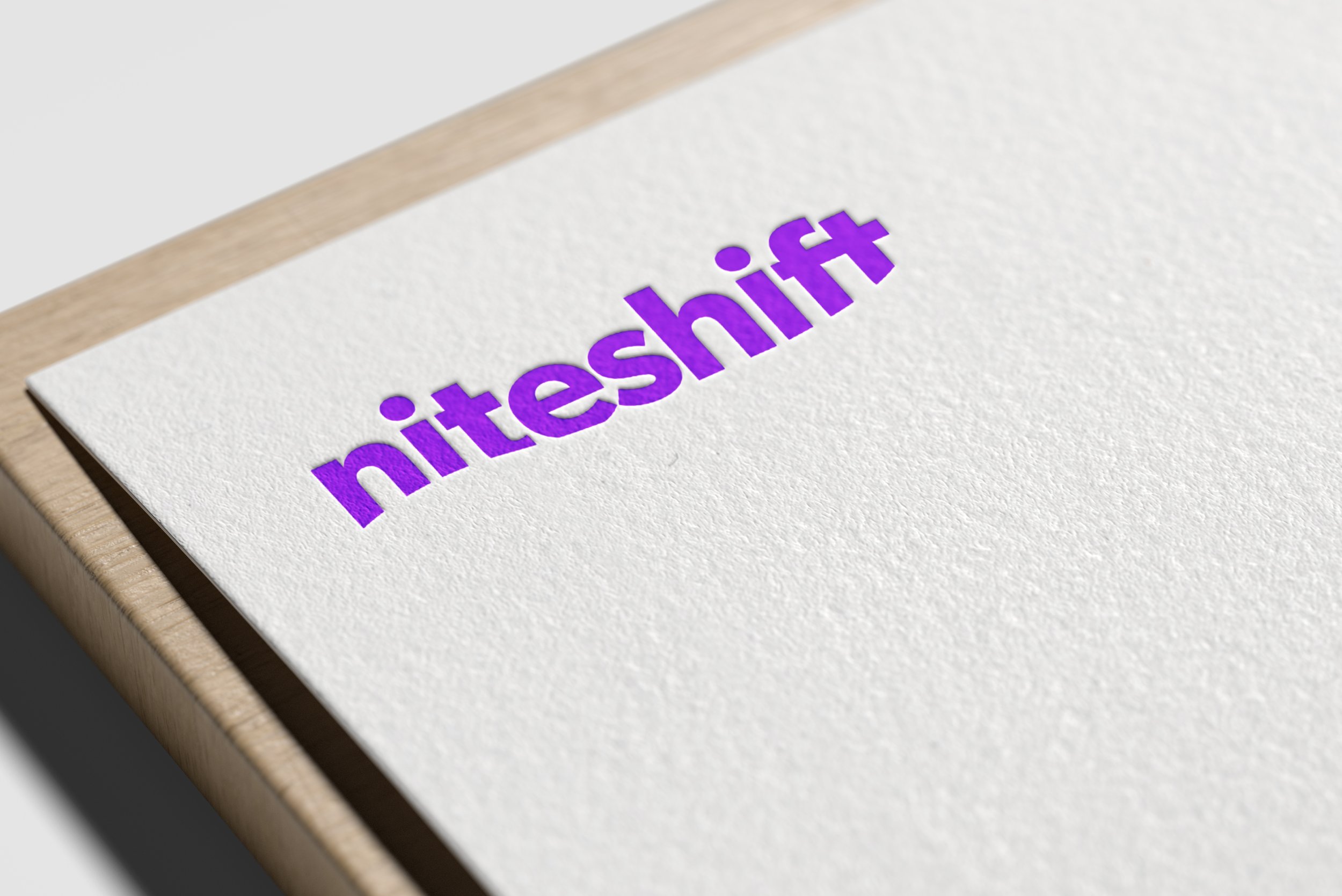
A company releasing a new smart duvet product to market needed a brand that could represent both this product, and the brand as a whole, as they develop further ranges.
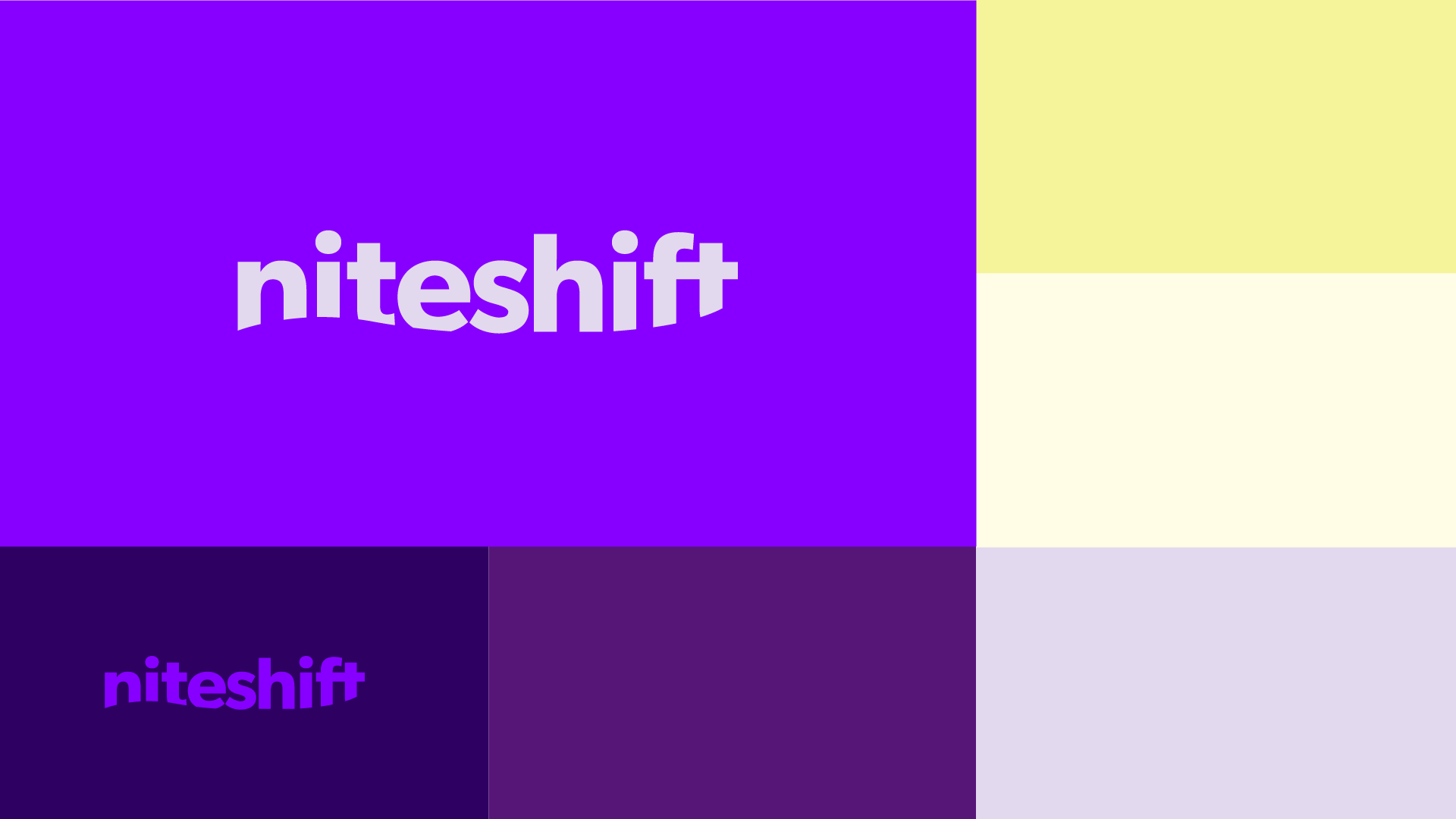
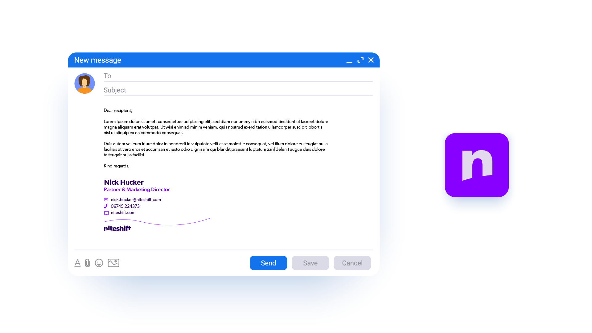
This initial concept was designed as a simple, strong brand with the air flow used in the duvet’s technology represented in the curved line along the bottom of the logotype. This air flow curve has then been used as a visual device linking different communications.
The colour palette was chosen as purple is the midpoint between red and blue, neither hot or cold, representing the ideal sleeping temperature. The boldness of the purple shades used means the it will stand out against other sleep brands, and shows the confidence of the product.
