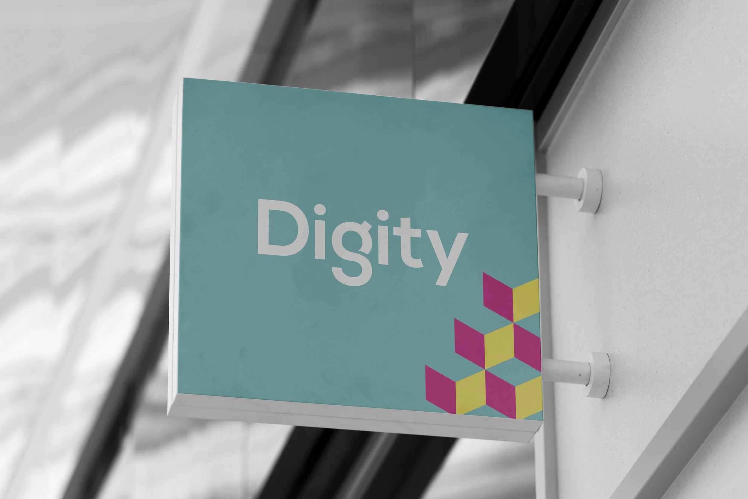
Marketing agency
re-brand.
Marketing and Design agency Digity needed an identity update to match the company’s bright and evolved outlook.
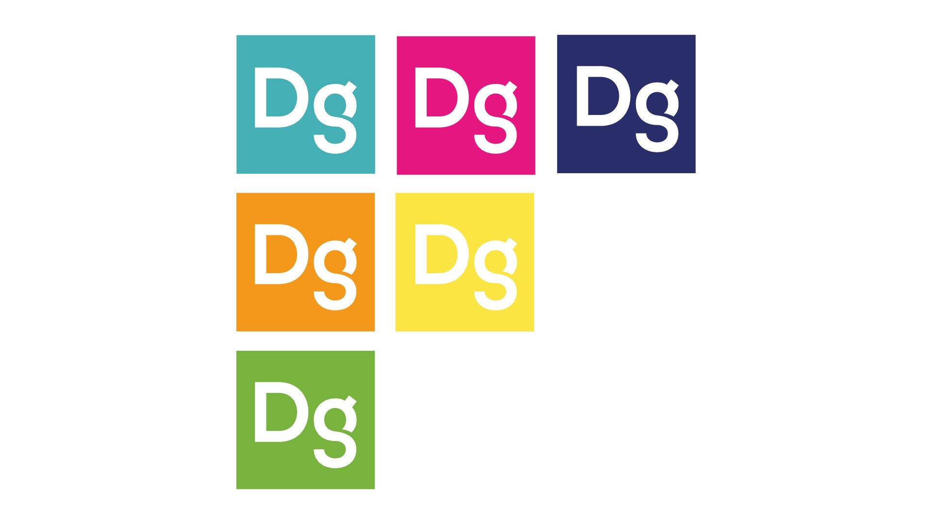
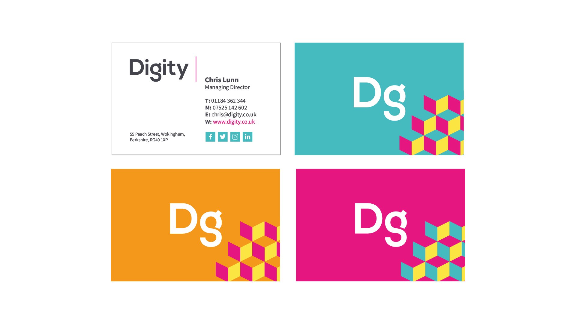
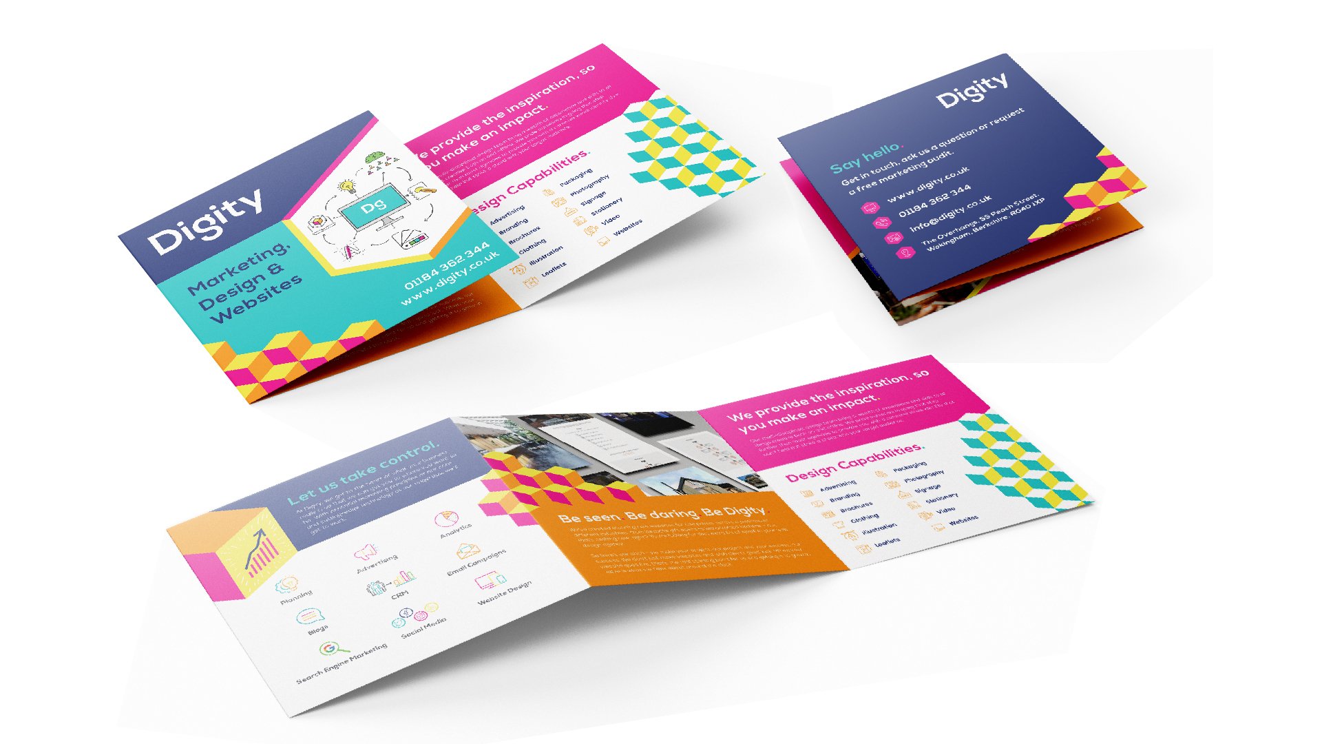
We created a fresh new brand, more flexible in its application both online and offline. As an in-house designer at Digity, I was heavily involved in the establishing of the official brand values. We then used these as a springboard for the visual components, creating the palette from colour associations corresponding with each value. This allowed us to show all sides of Digity, while giving a generous amount of freedom when it came to future design collateral.
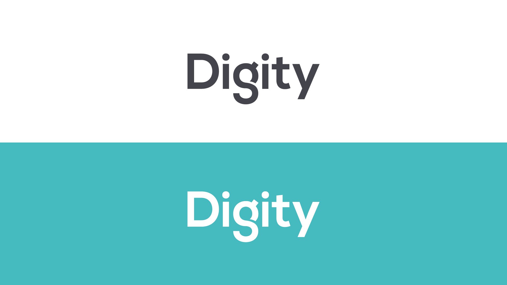
Where the colours carried the majority of the brand identity, the logotype itself needed to have an element of simplicity while also being uniquely recognisable no matter where it was used.
The shortened sub-mark uses the Dg as the most recognisable parts of the full logotype, making the overall brand flexible to adapt to all uses.
